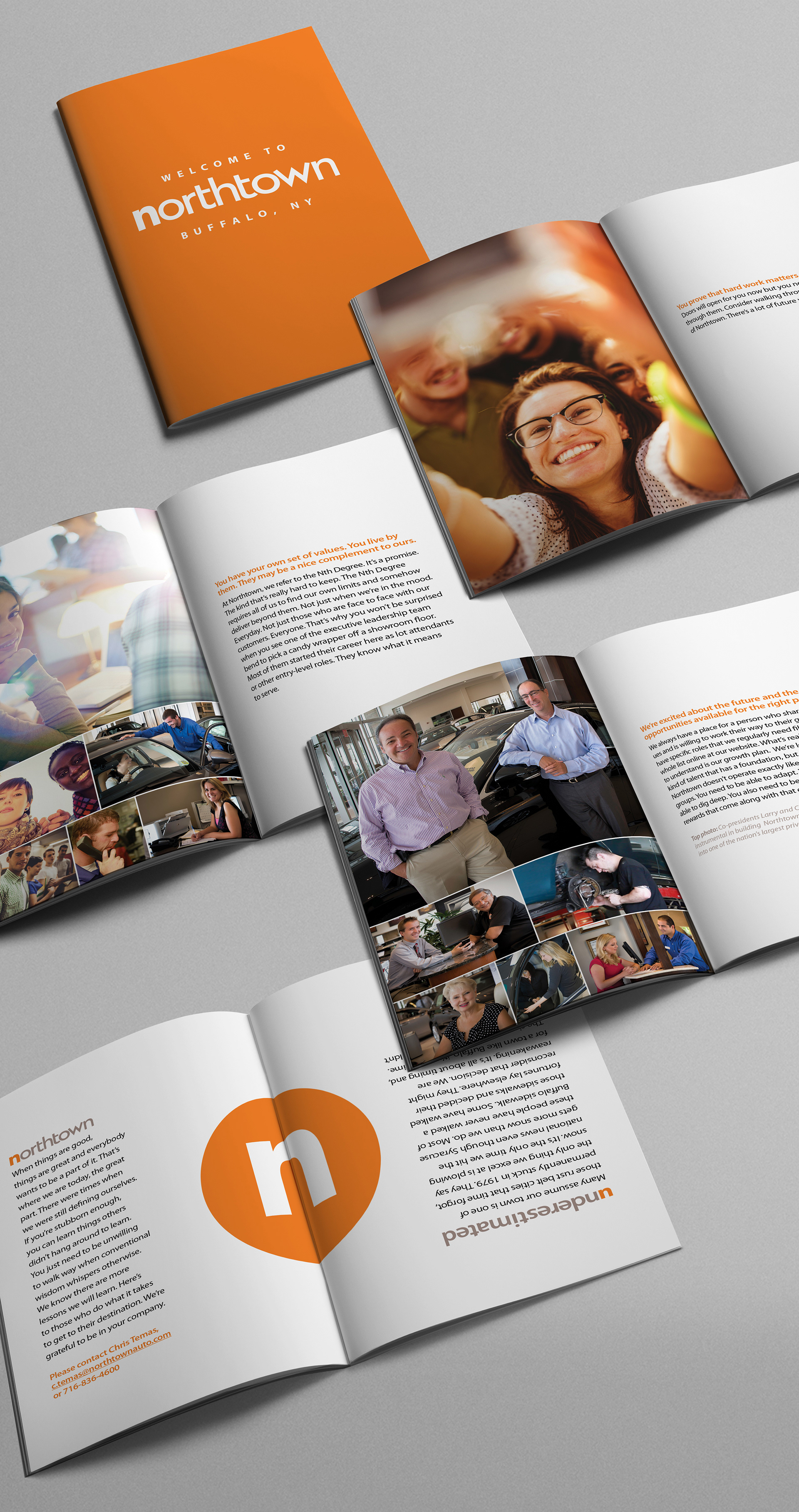
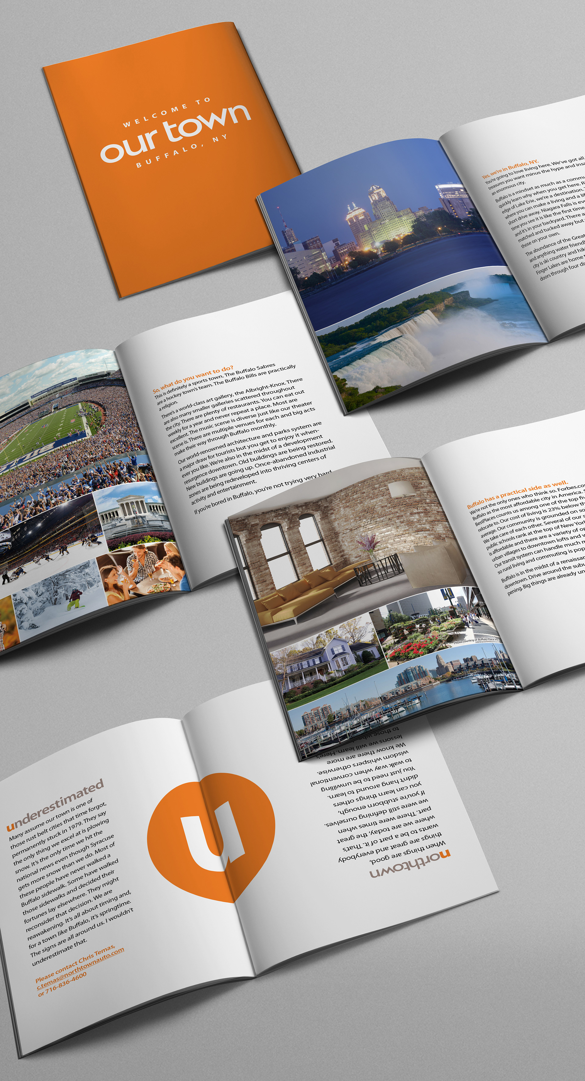
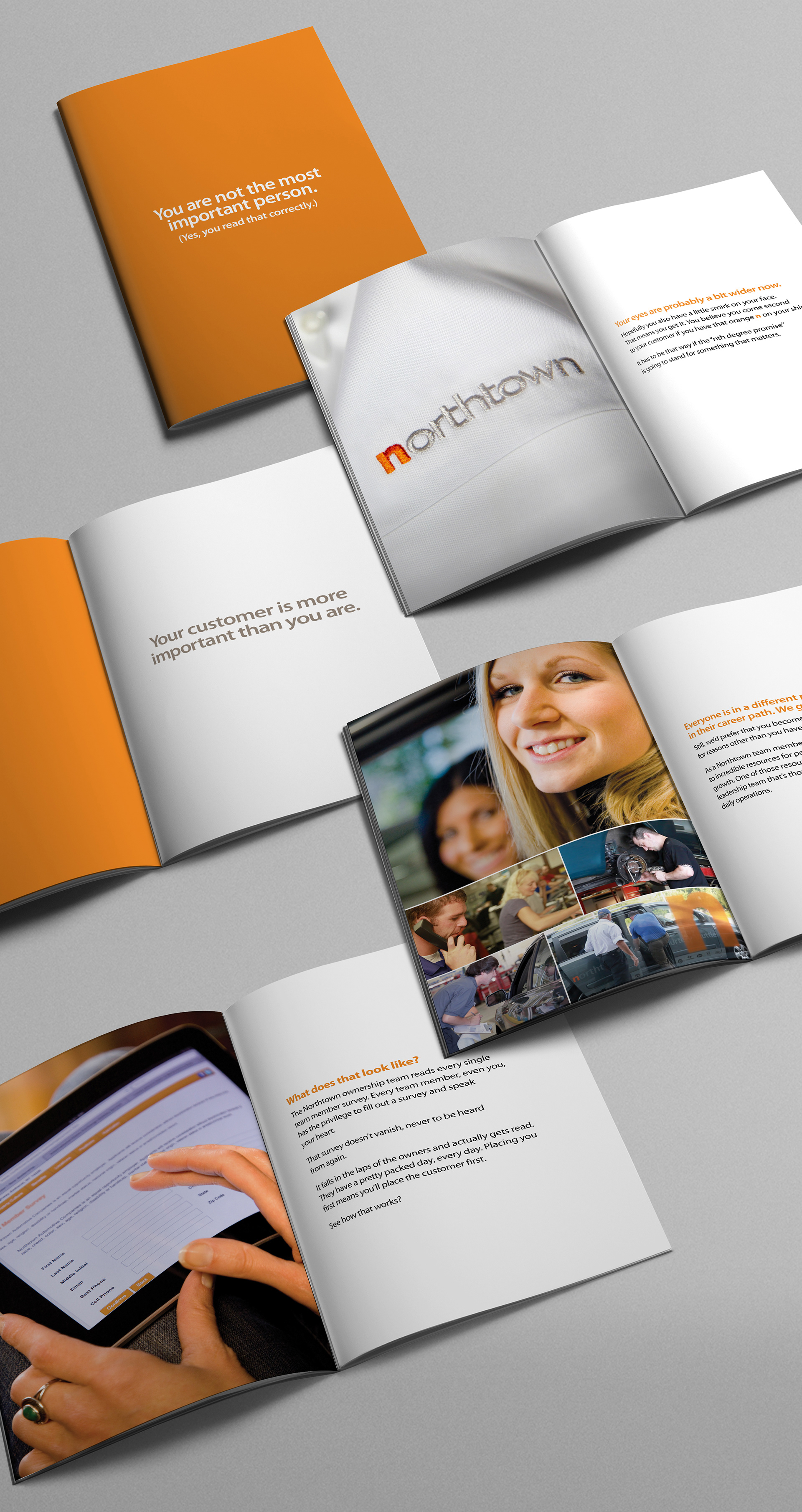
Northtown Auto had two goals in mind for this brochure: attract recent graduates to apply for jobs at Northtown Auto, and communicate that Buffalo, New York is a great place to live and work.
I designed a brochure with two “front” covers: one for Northtown and the other for Our Town (Buffalo) with the two stories meeting in the middle. In the middle spread, the n symbolizes Northtown, and the u (once the brochure is turned around) symbolizes underestimated. Buffalo, New York is often an underestimated area.
Copywriting by Of the Sea.

Some simple crest designs for their service department.

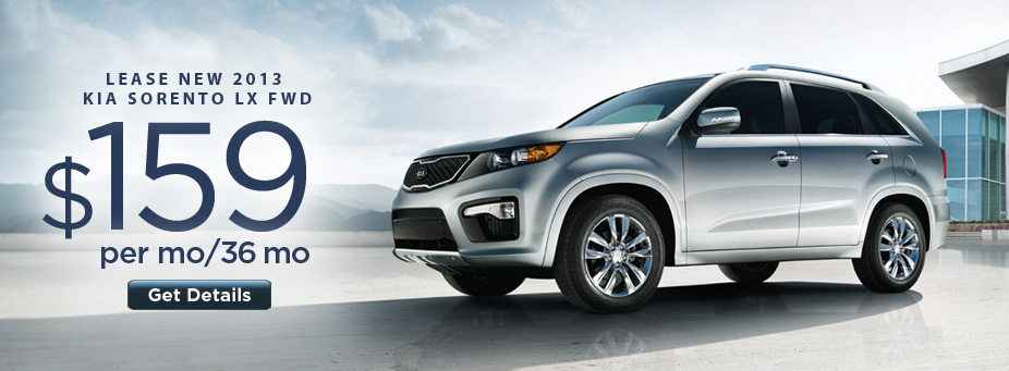


Website manufacturer slider ads.
Employee recruitment brochure.