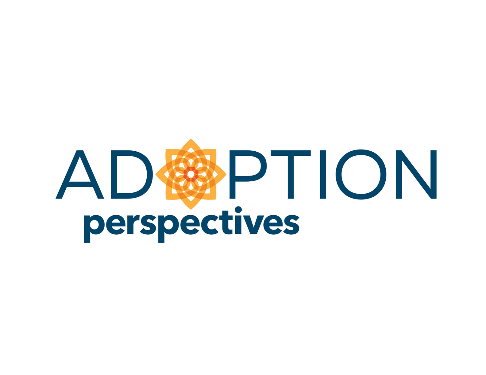
Adoption Perspectives is not an adoption agency. So they didn’t want to look like a typical nonprofit adoption agency.
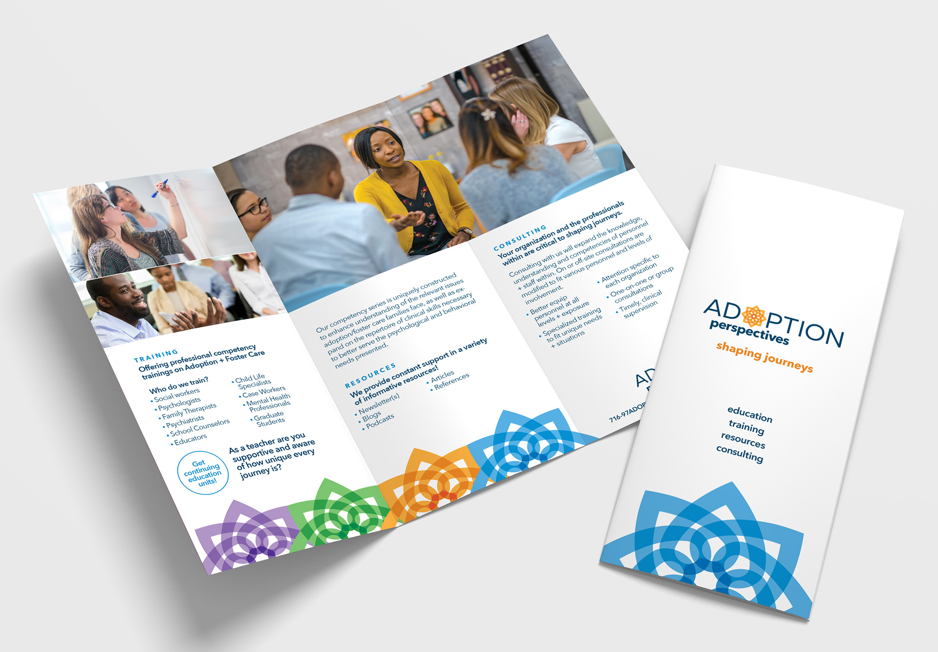
The start-up company provides educational services to groups and professionals that work with families and individuals to enhance their understanding, coping and management of challenges associated with the adoption journey.
At the top of their list was the desire to look professional, not child-like. They also wanted their graphics to have a contemporary feel as well as convey optimism.
I decided the best course of action was to draw attention to their name perspectives. This moved us away from the look of an adoption agency and placed the focus on their service — providing different perspectives and insights on adoption issues.
I set out to create an icon using directional arrows; however, using arrows lacked the feeling we were after, and so I took some artistic license to create a “directional compass” out of interconnected hearts.
The icon had the look and feel of something new and growing — like a flower or a sun. This coincided with their goal of changing the culture surrounding adoption and foster care.
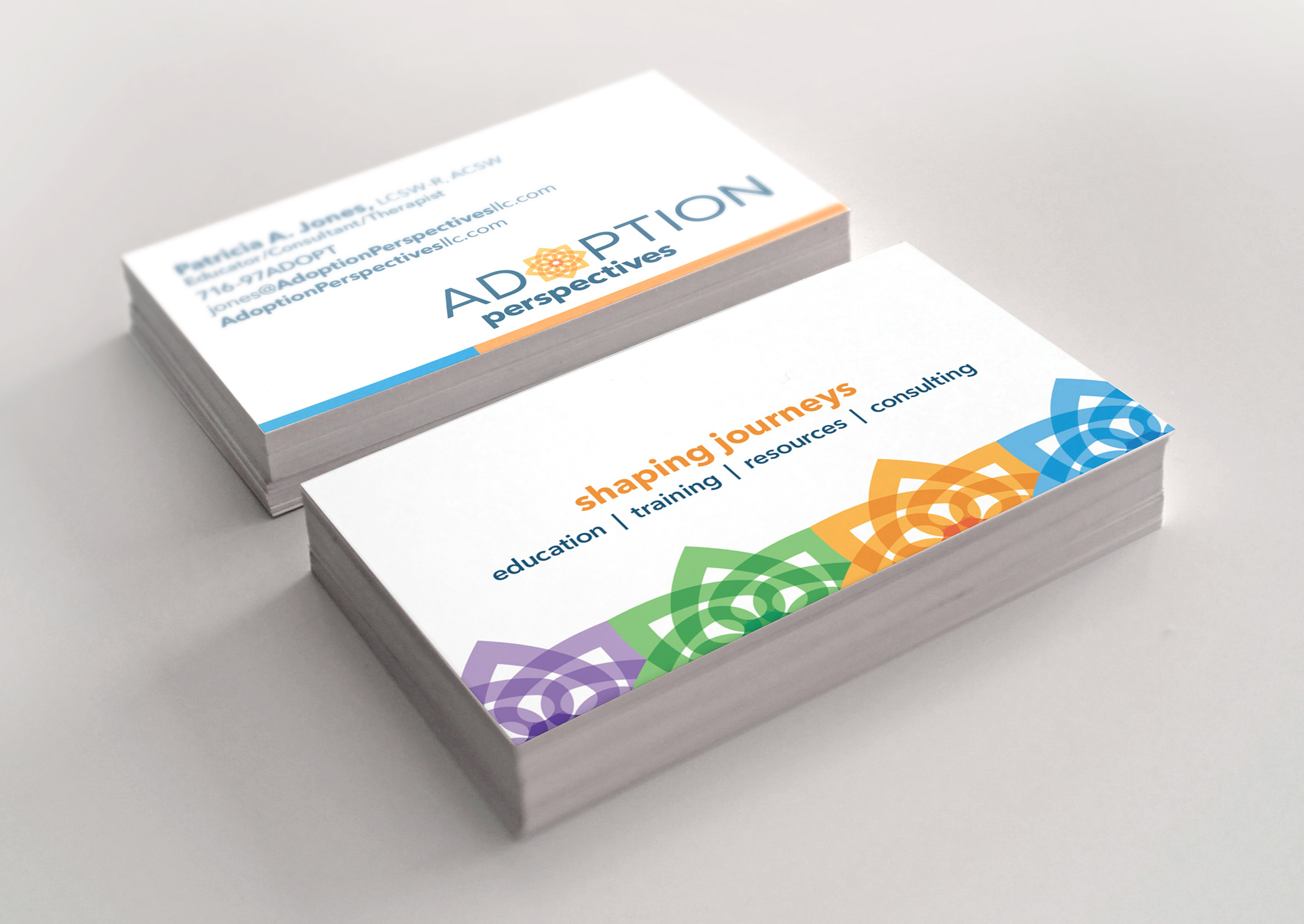
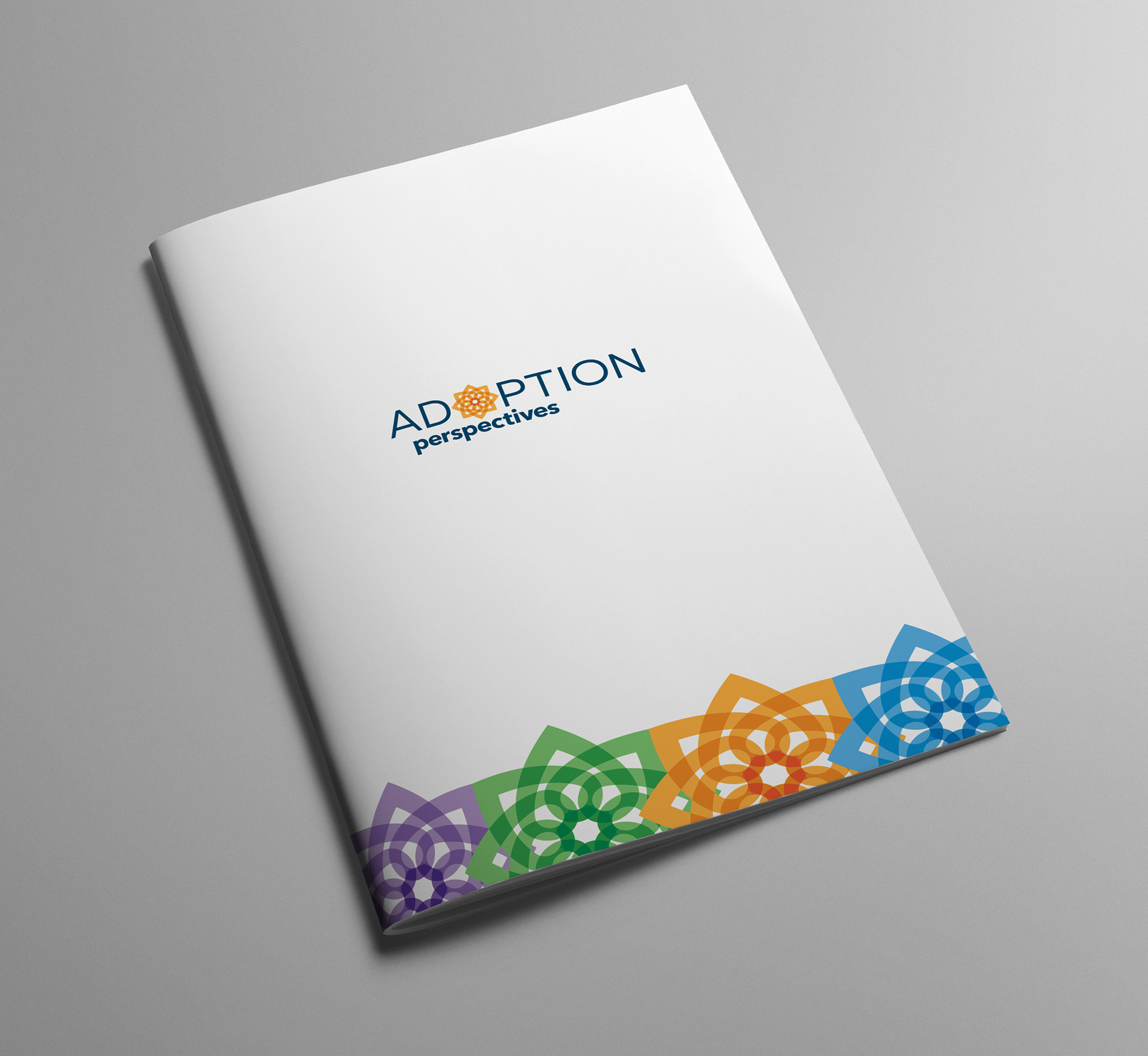
I chose brighter colors to give the icon an upbeat feeling. These colors are also used to represent different areas of their services: education, training, resources and consulting.