Full page ad
In 2016, Catholic Cemeteries decided it was time to refresh their brand. They’d been using a very traditional typeface with the Buffalo Catholic Diocese's coat of arms, which appeared regal and upscale.
Catholic Cemeteries wanted a logo that conveyed comfort, compassion, reliability and trust.
We first selected an engaging typeface that is a blend between traditional/conservative and friendly/comforting. I also designed several symbols to coincide with the new type selection. The symbols ranged from more traditional (selected) to a bit more creative.
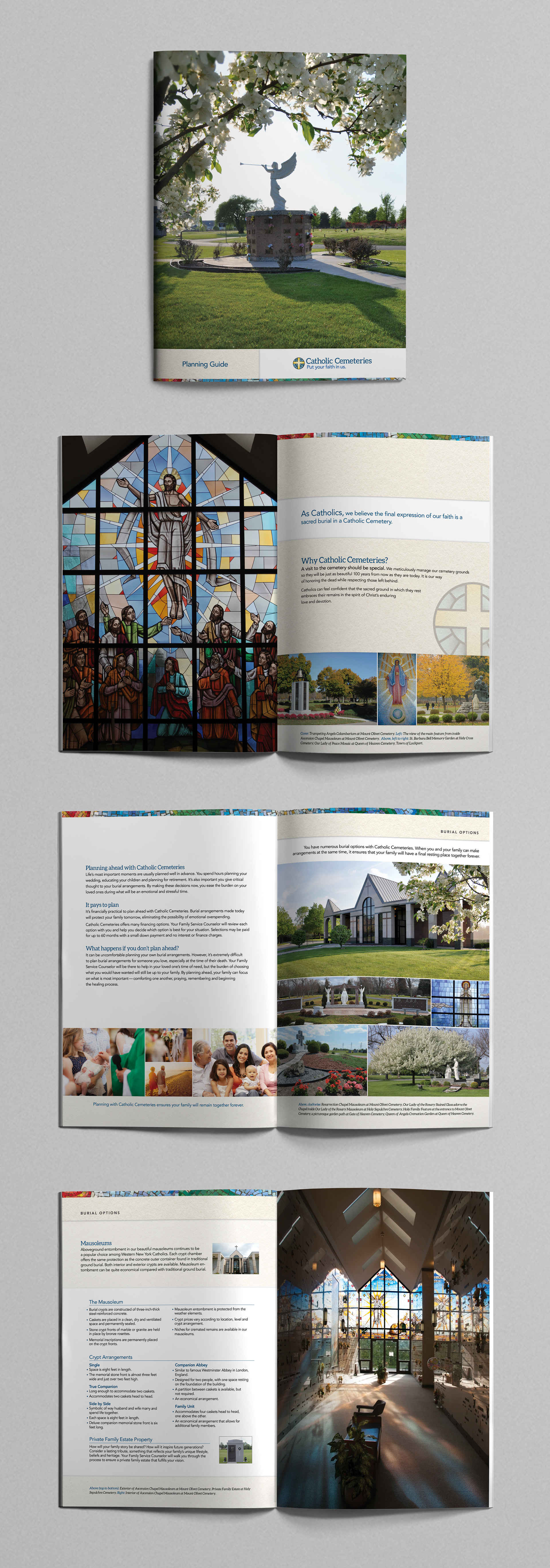
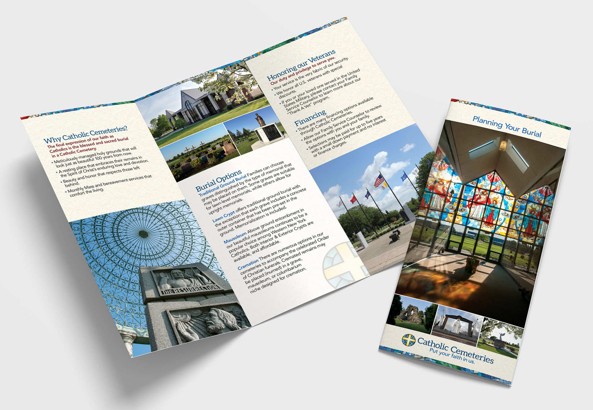
Death is a difficult subject. My approach to their graphics was to create something beautiful to help ease the pain associated with loss and to provide comfort.
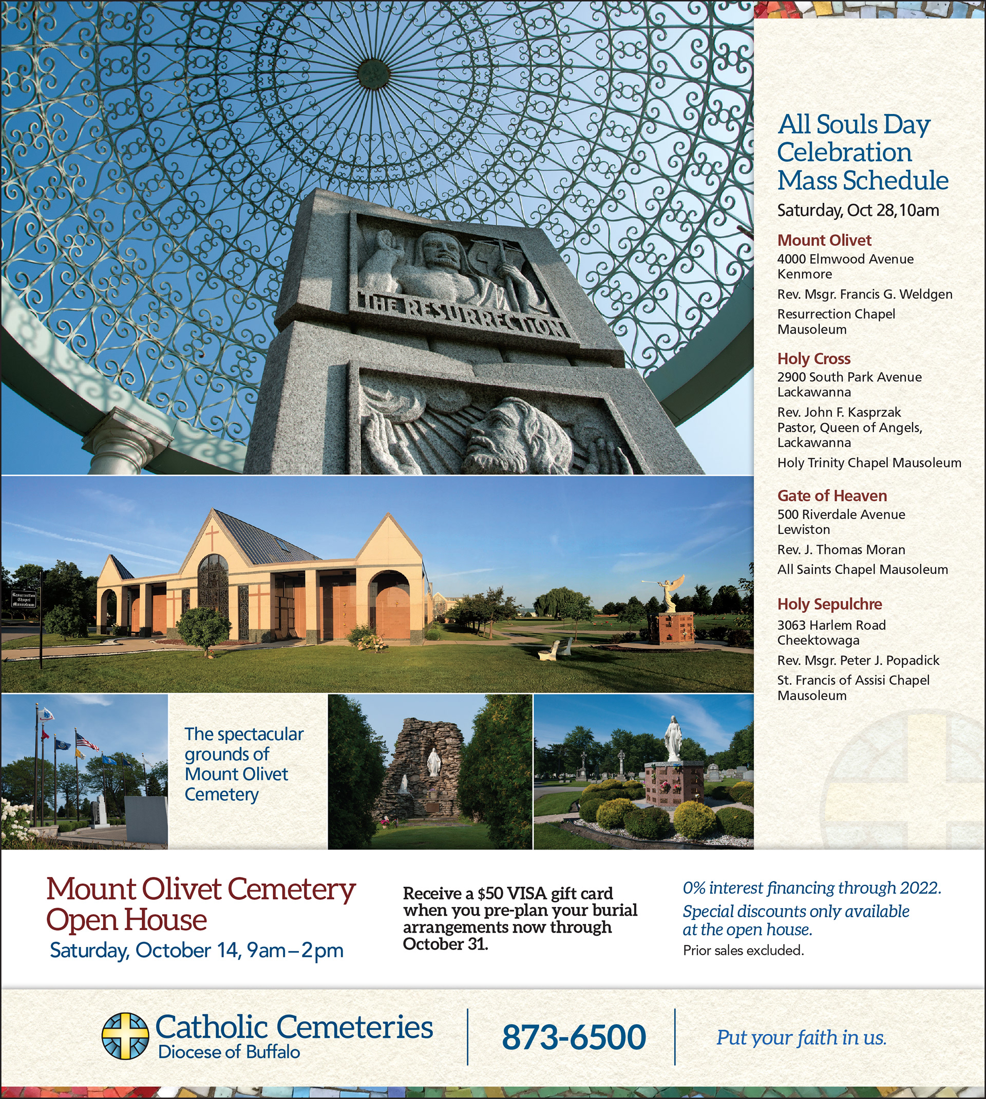
I focused on artwork physically found within the Catholic Cemeteries – from beautiful mosaics and stained glass windows, to gardens and sculpture — there were a lot of available options for their marketing materials.
Marketing direction and copywriting by Shovel the Sidewalk.