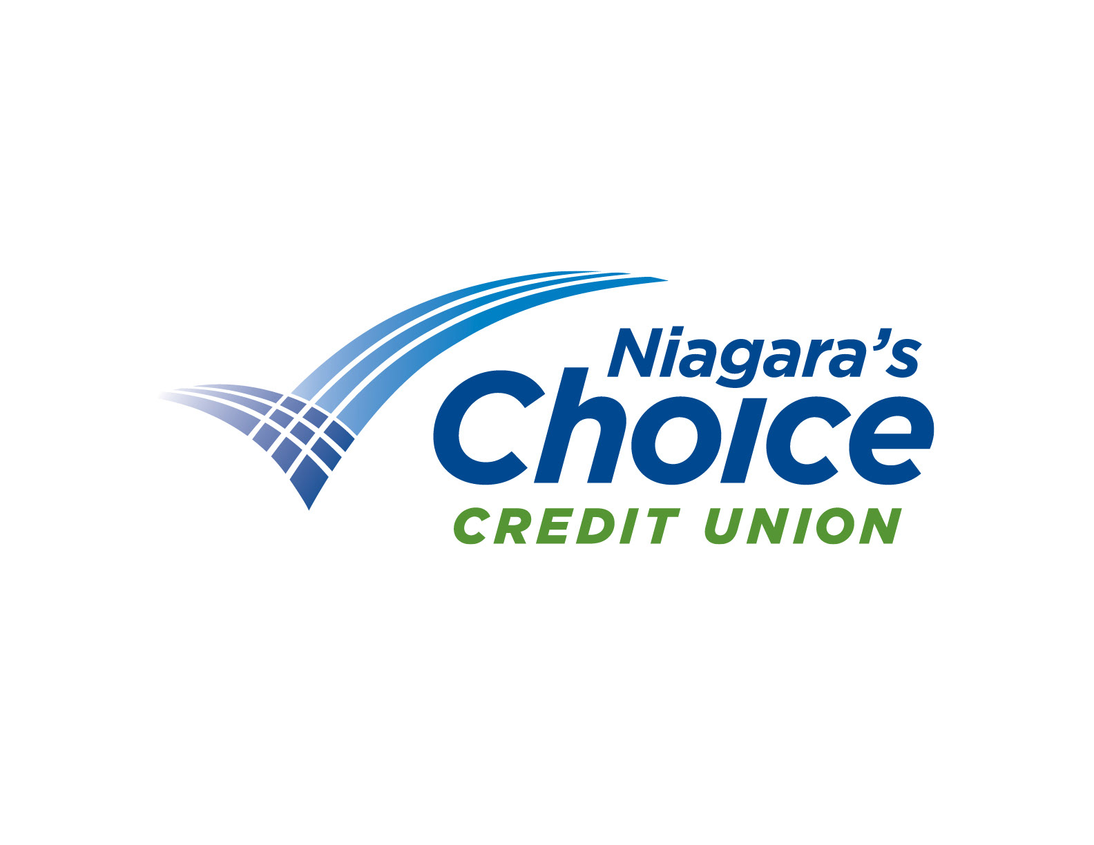
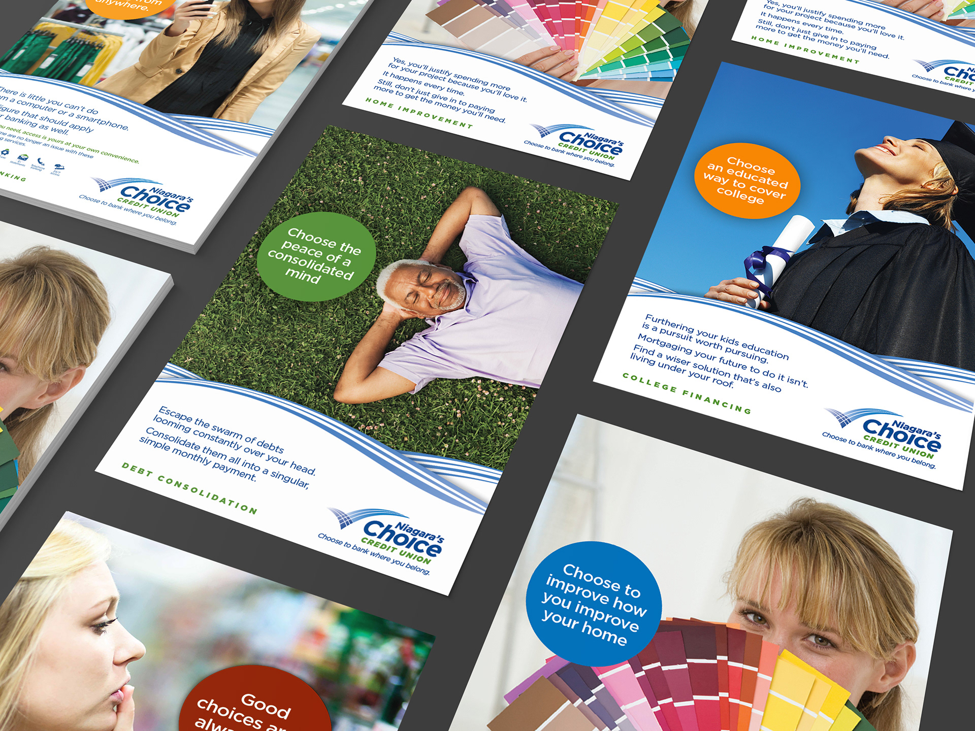

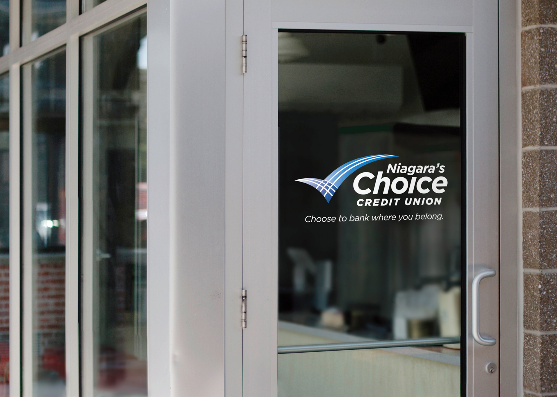
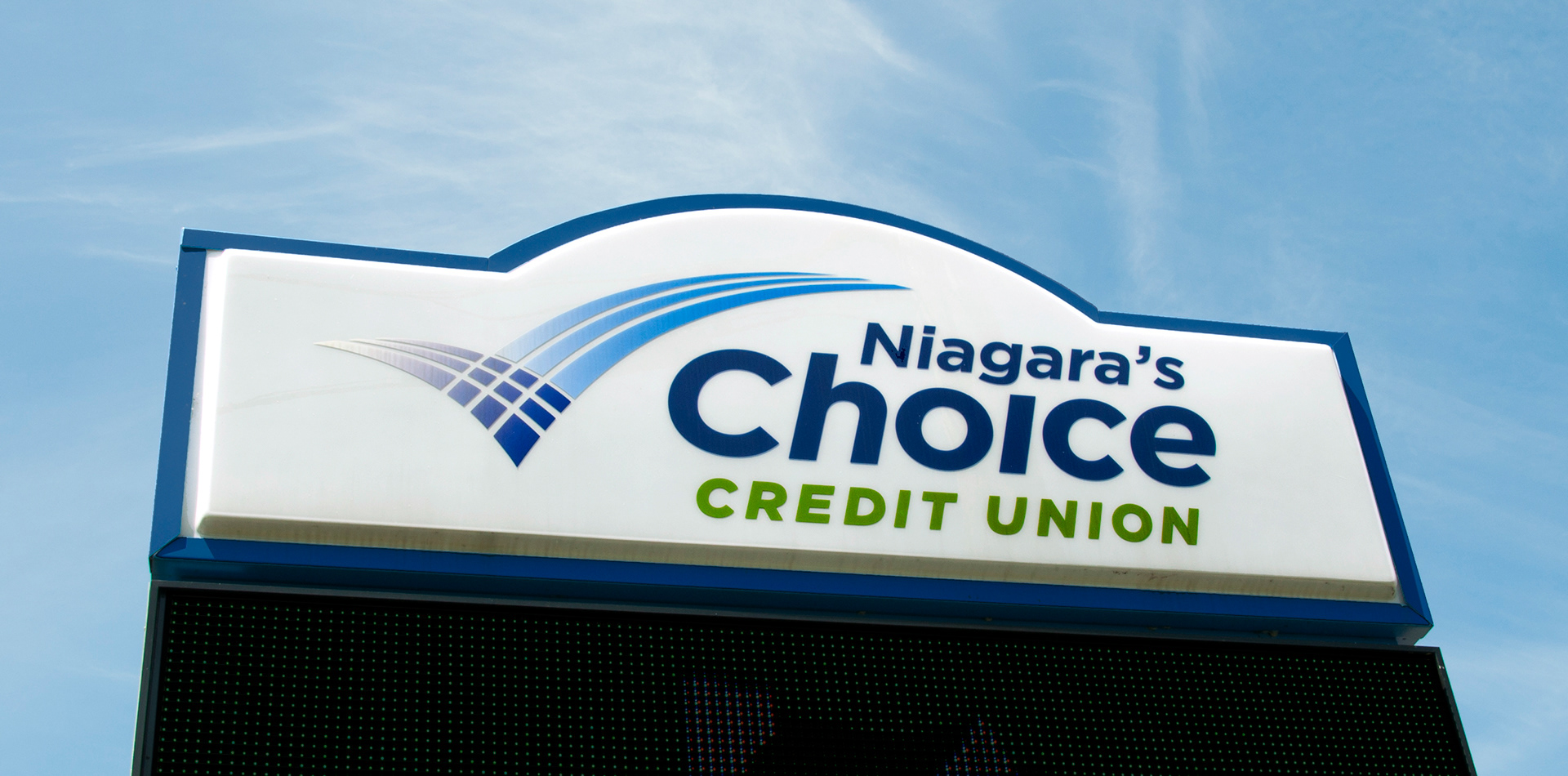
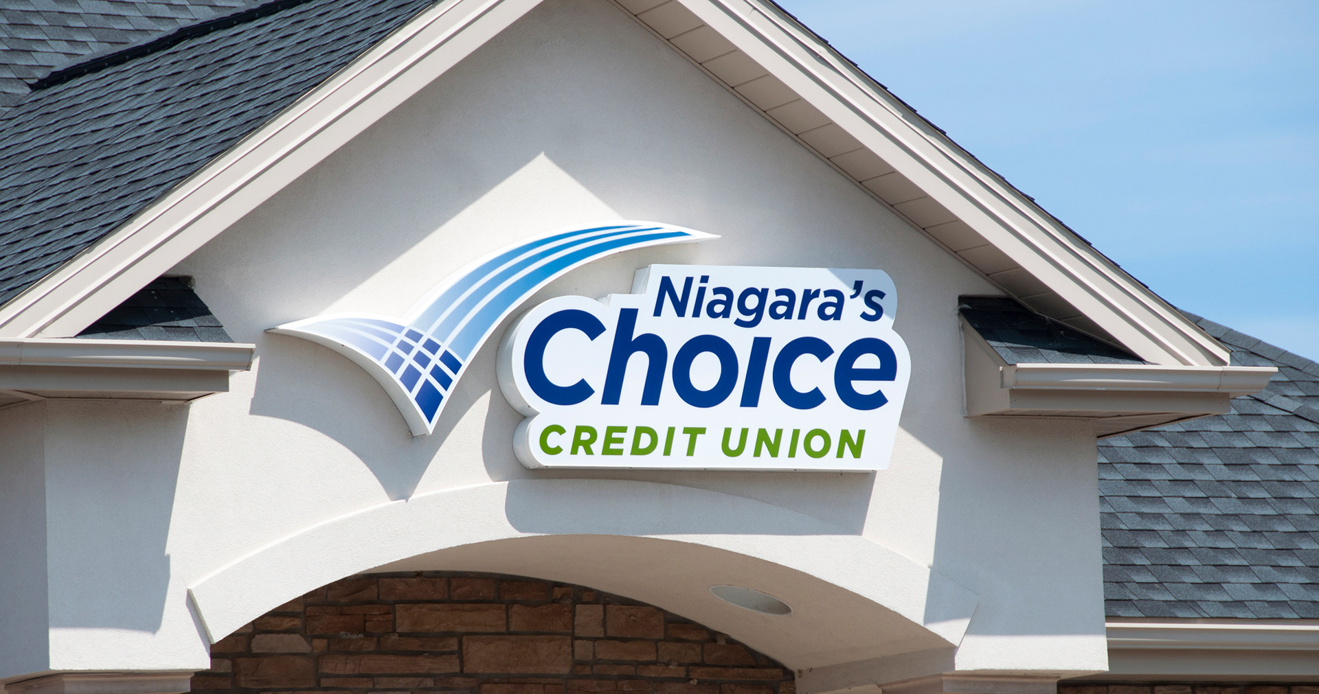
Niagara's Choice’s logo combines a check mark symbolizing choice (which I think is a bit cliché) with the waterfalls from its backyard neighbor, Niagara Falls.
Sometimes, a visual cliché is needed to communicate an idea, but that cliché needs an added twist to stand out as interesting and unique (hence the waterfalls).
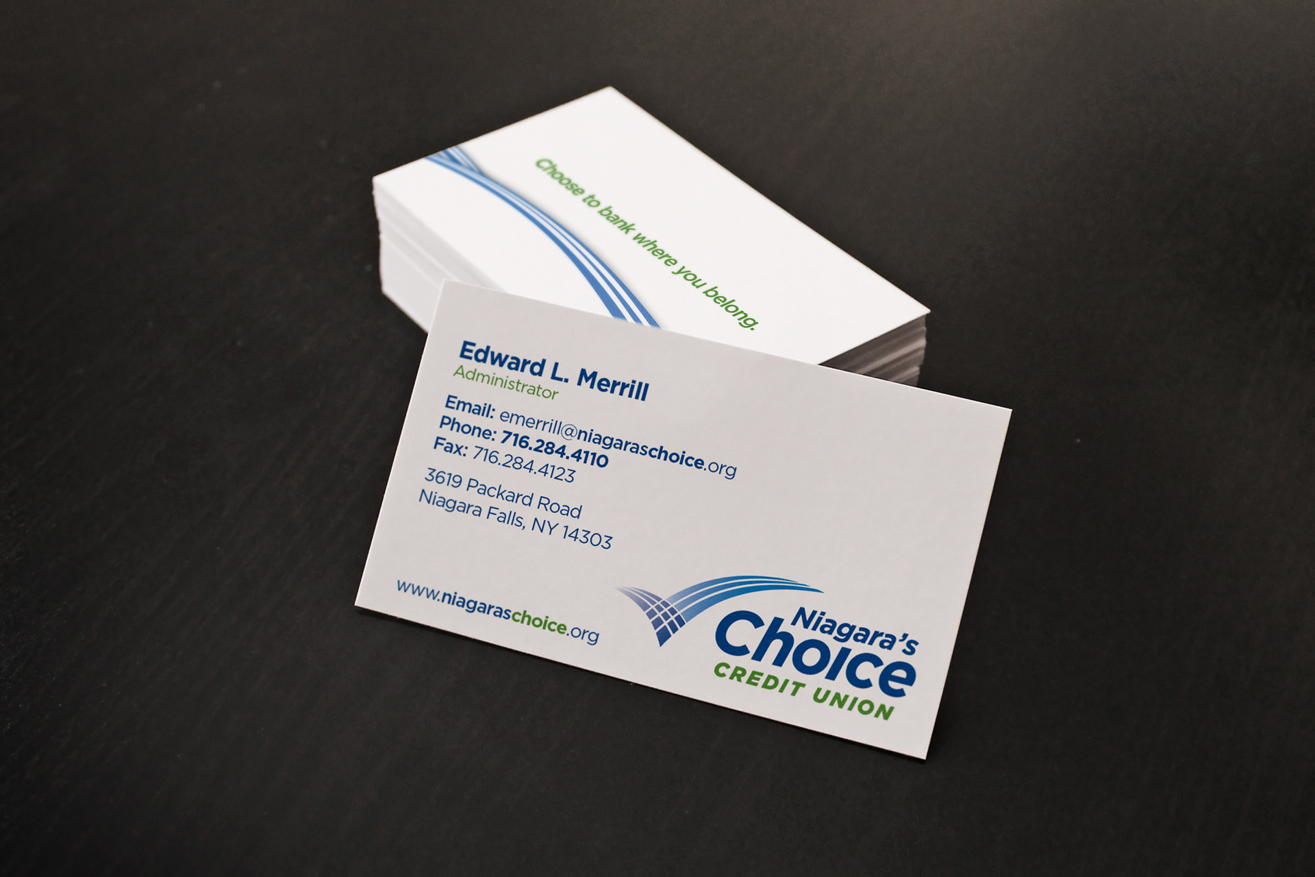
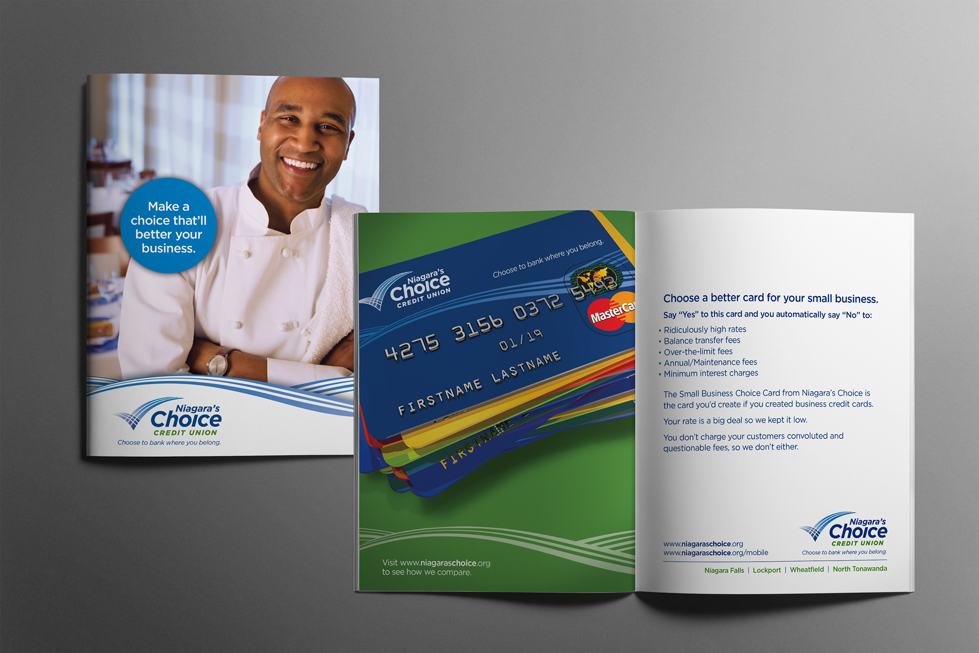
I created a secondary graphic (complementary to the logo) representing the Niagara River rapids to be used as another identifying feature for branding.
Marketing direction and copywriting by Of the Sea.