
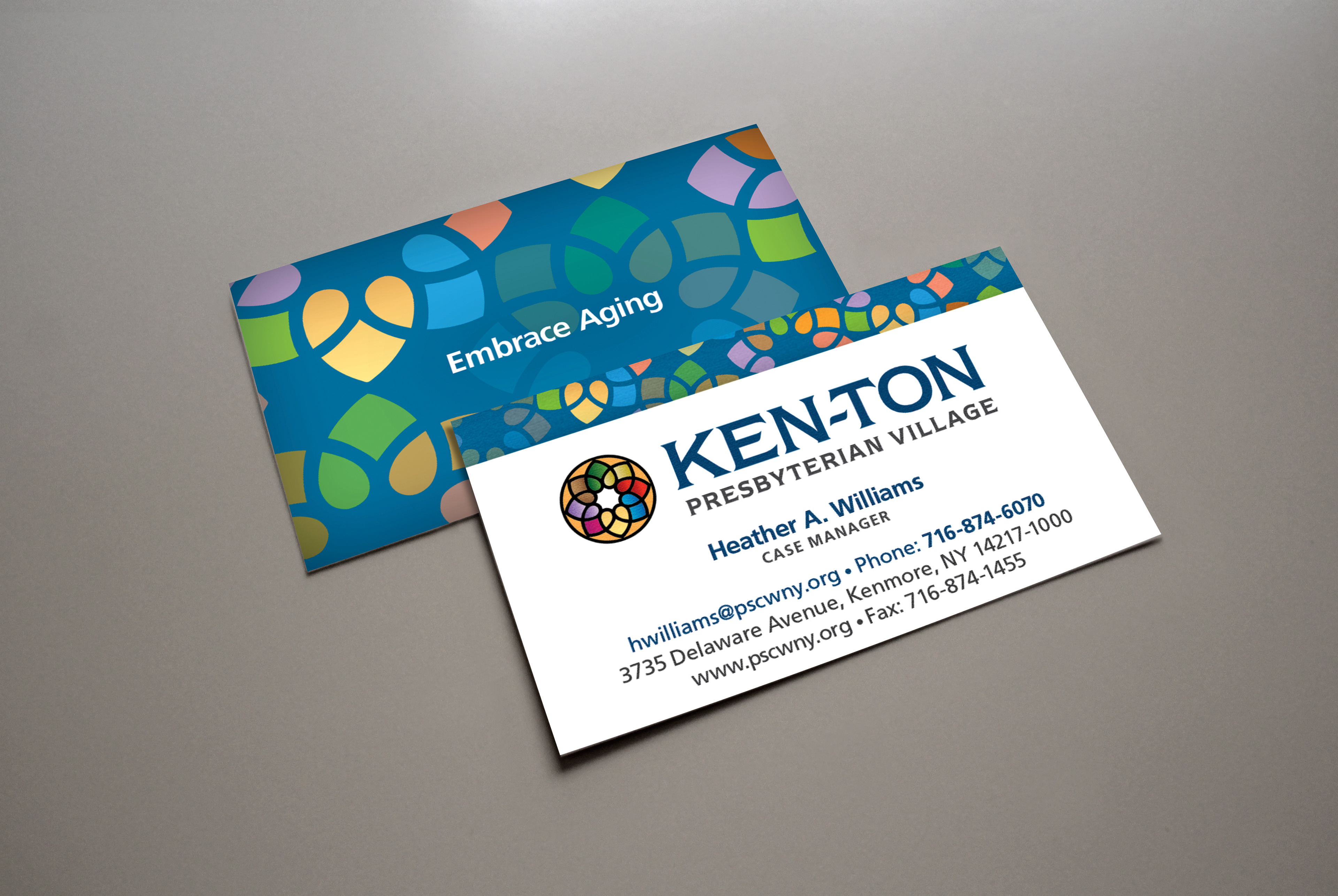
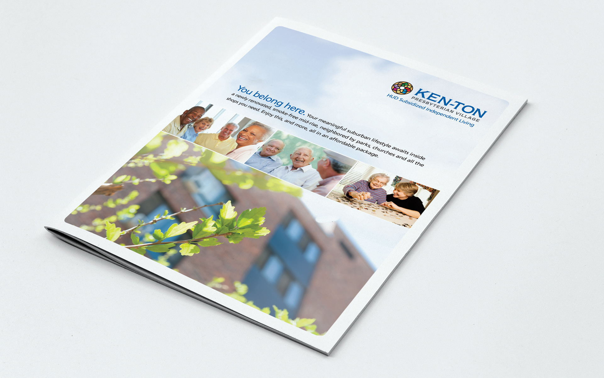
Brochure for Ken-Ton Presbyterian Village.
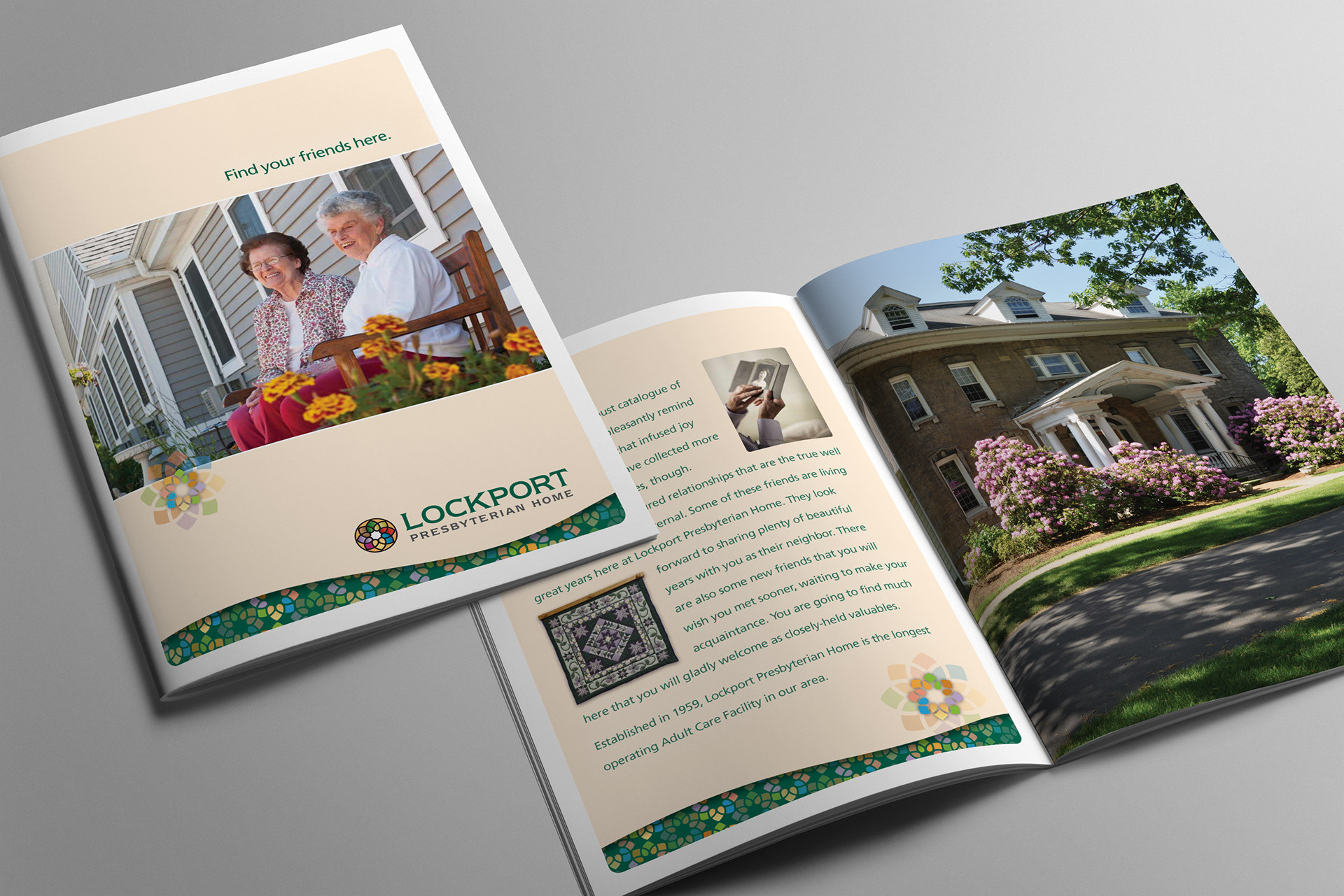
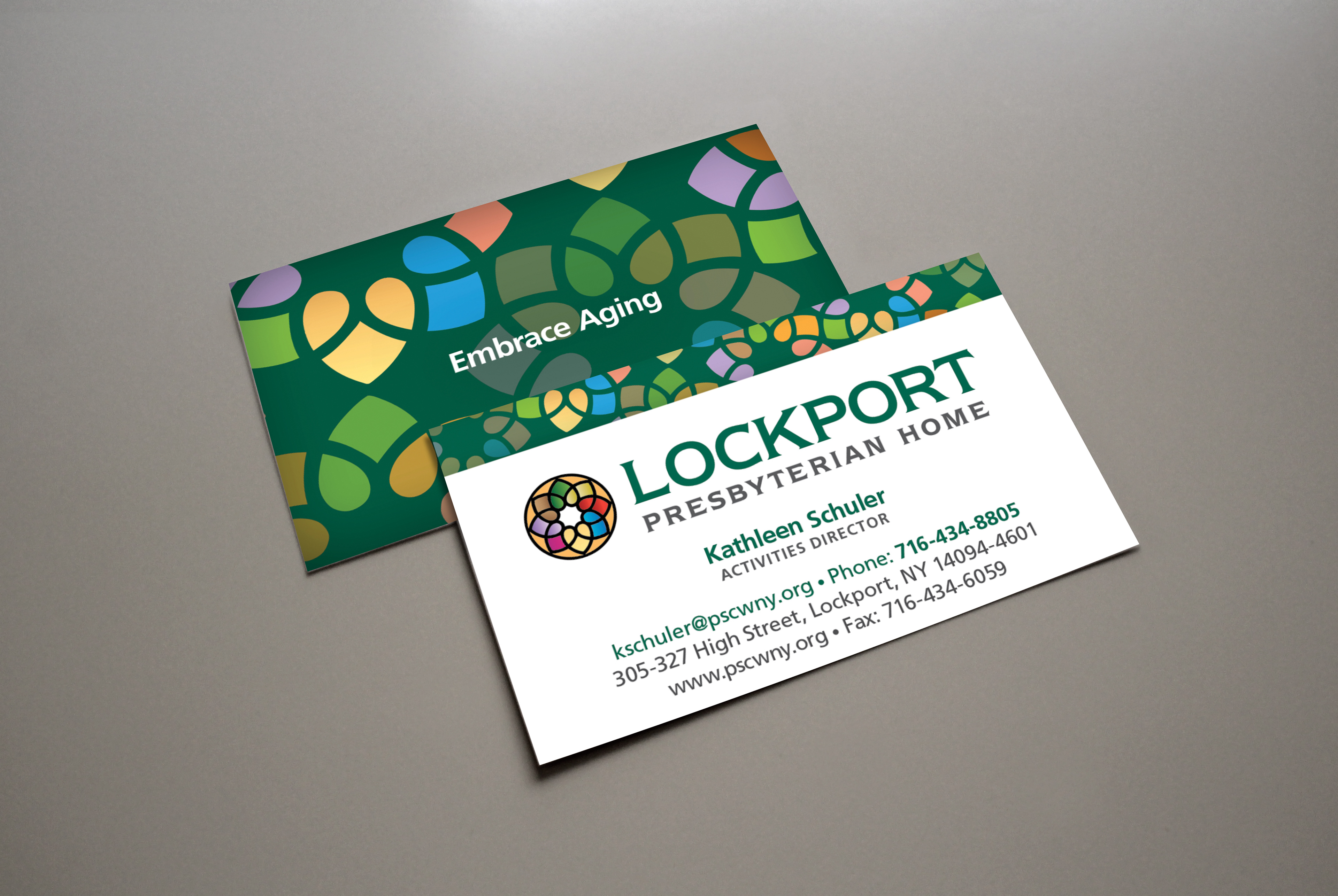
Brochure for Lockport Presbyterian Home.
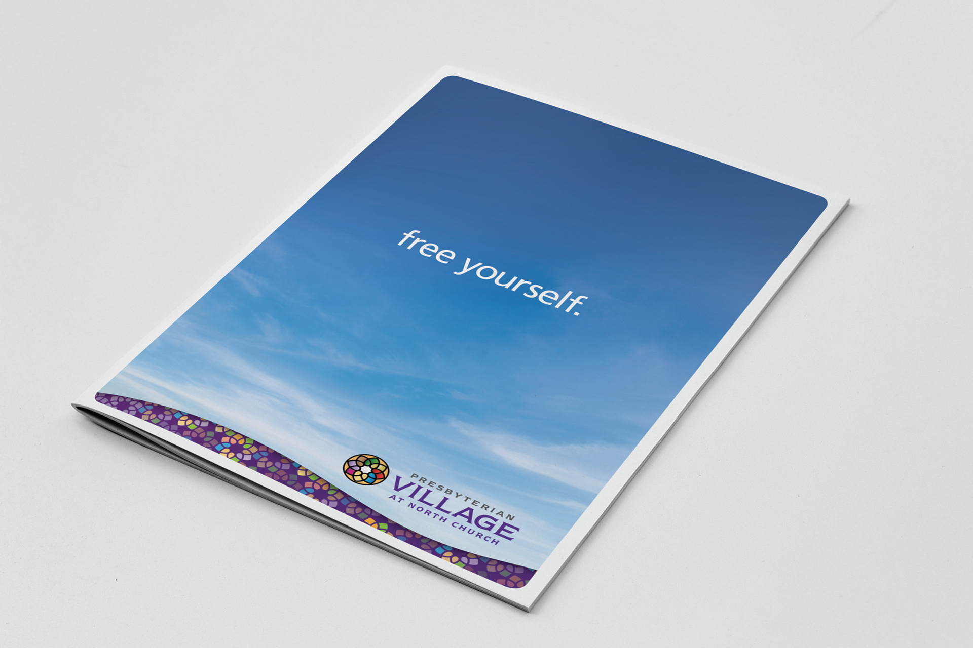

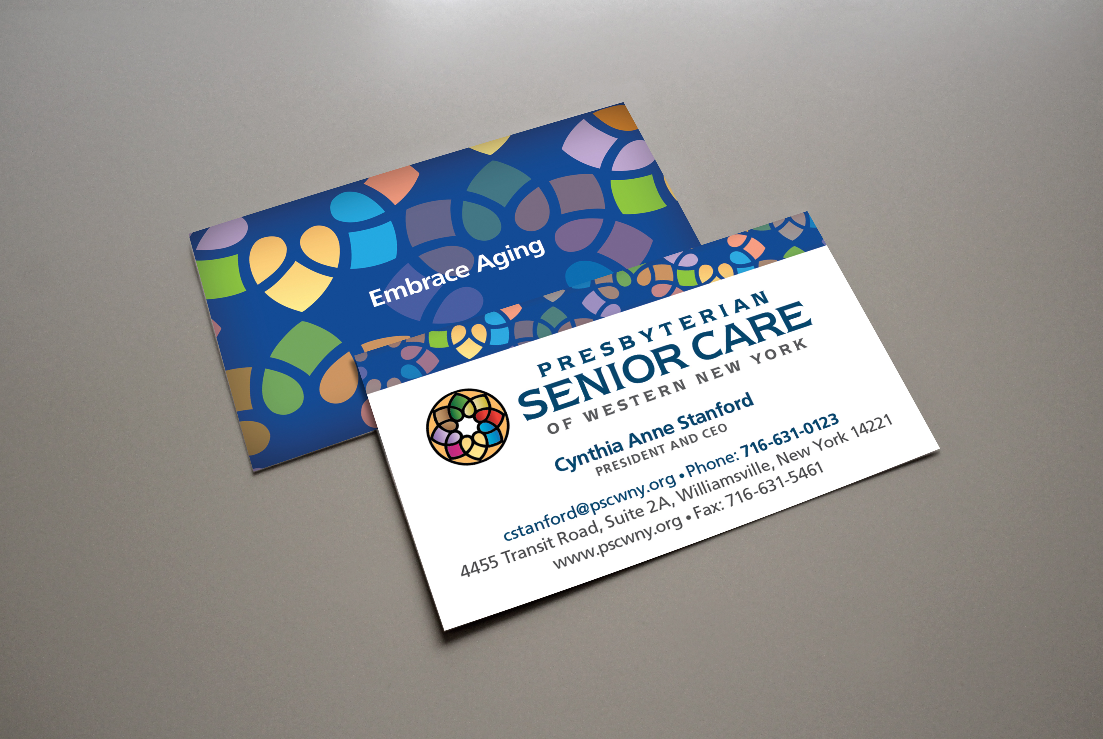
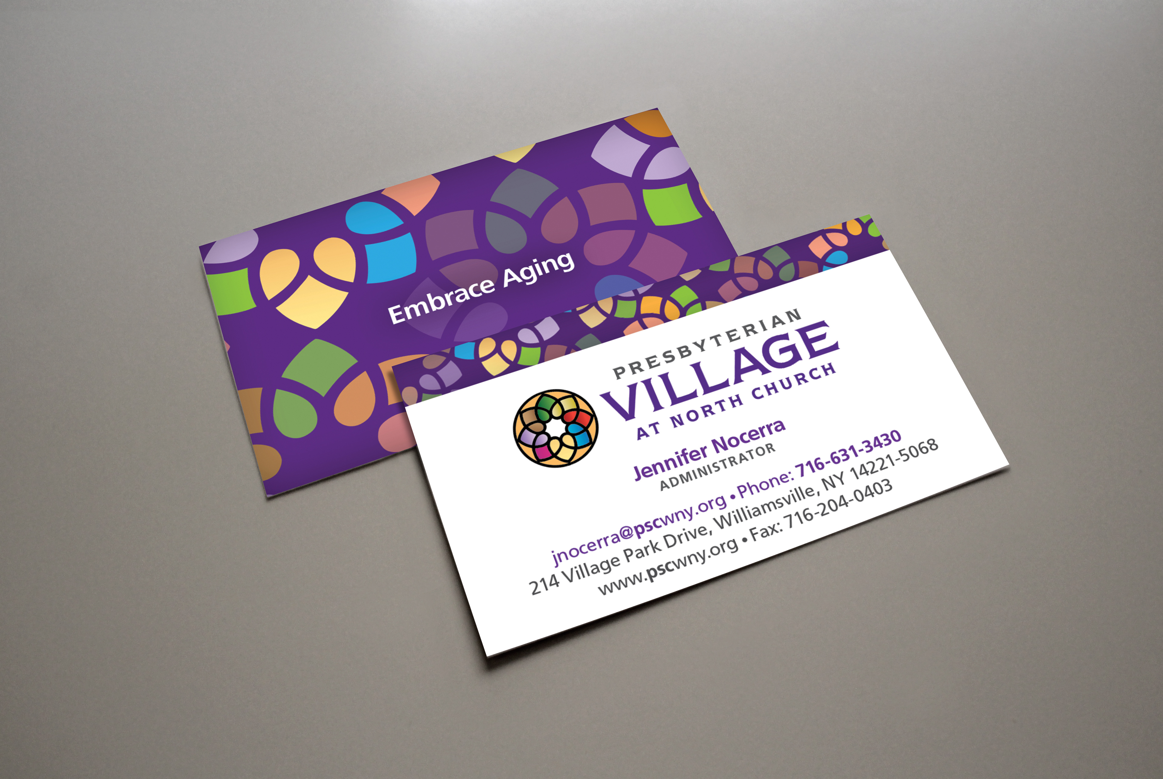
Brochures for Presbyterian Senior Care Village at North Church facility.
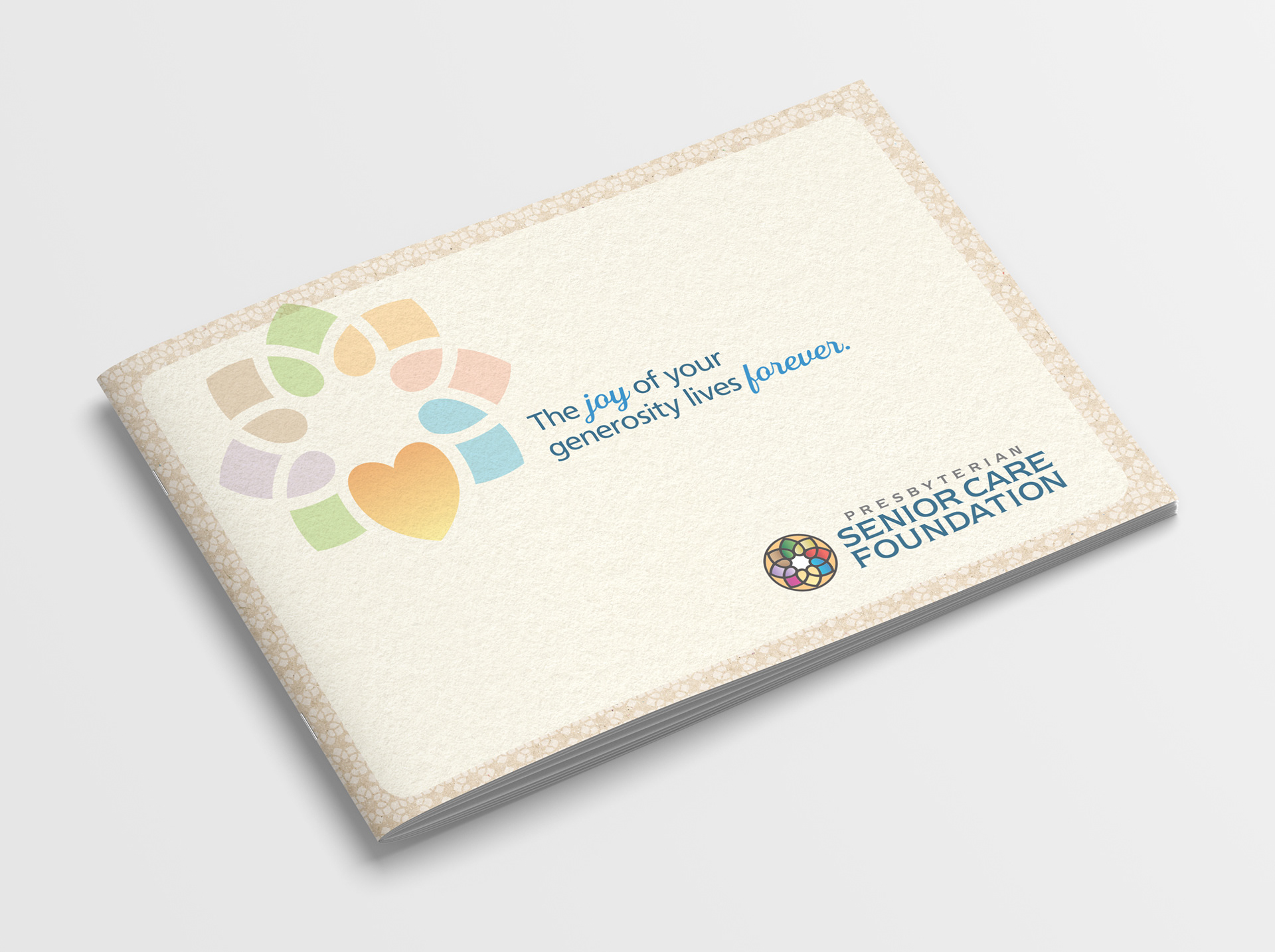
Foundation brochure and mailer.
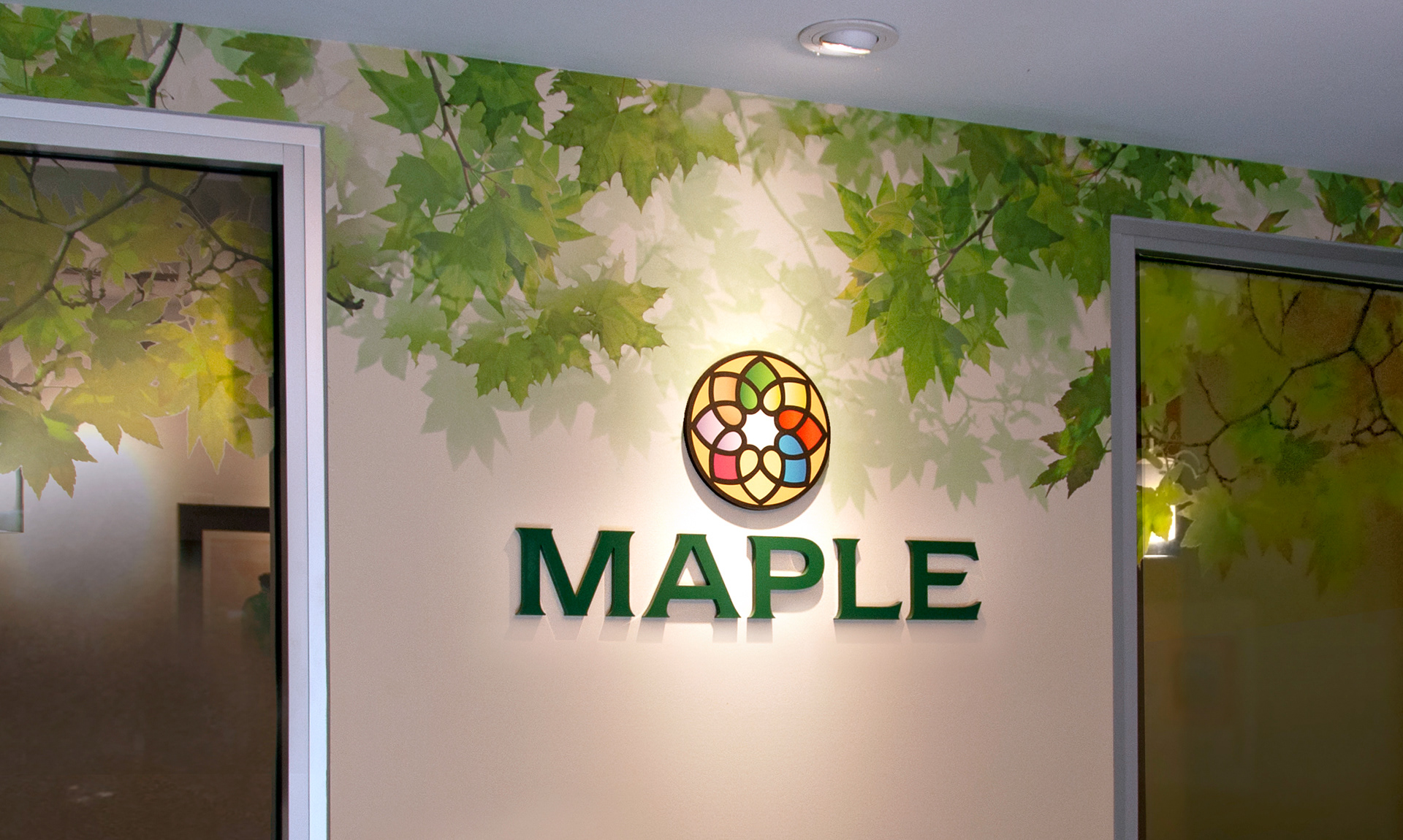
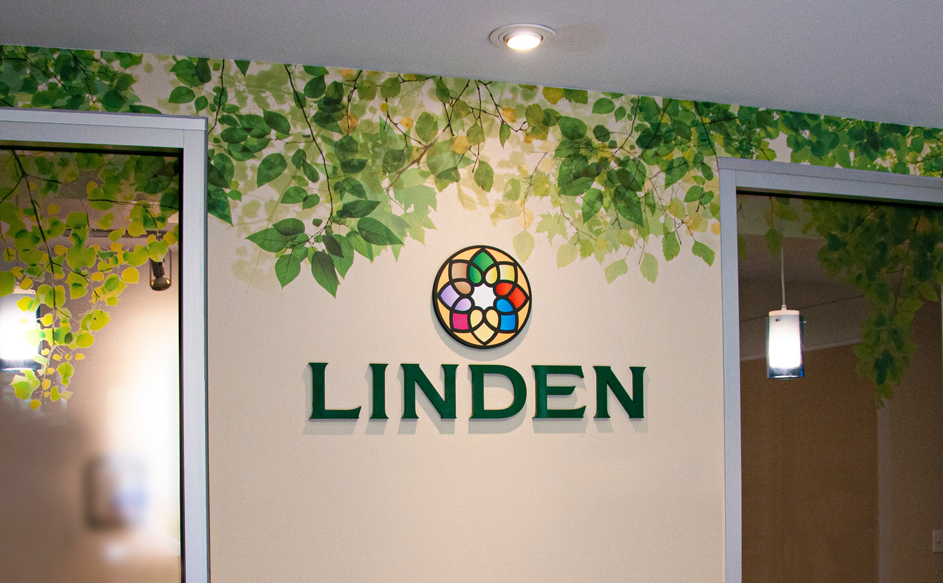
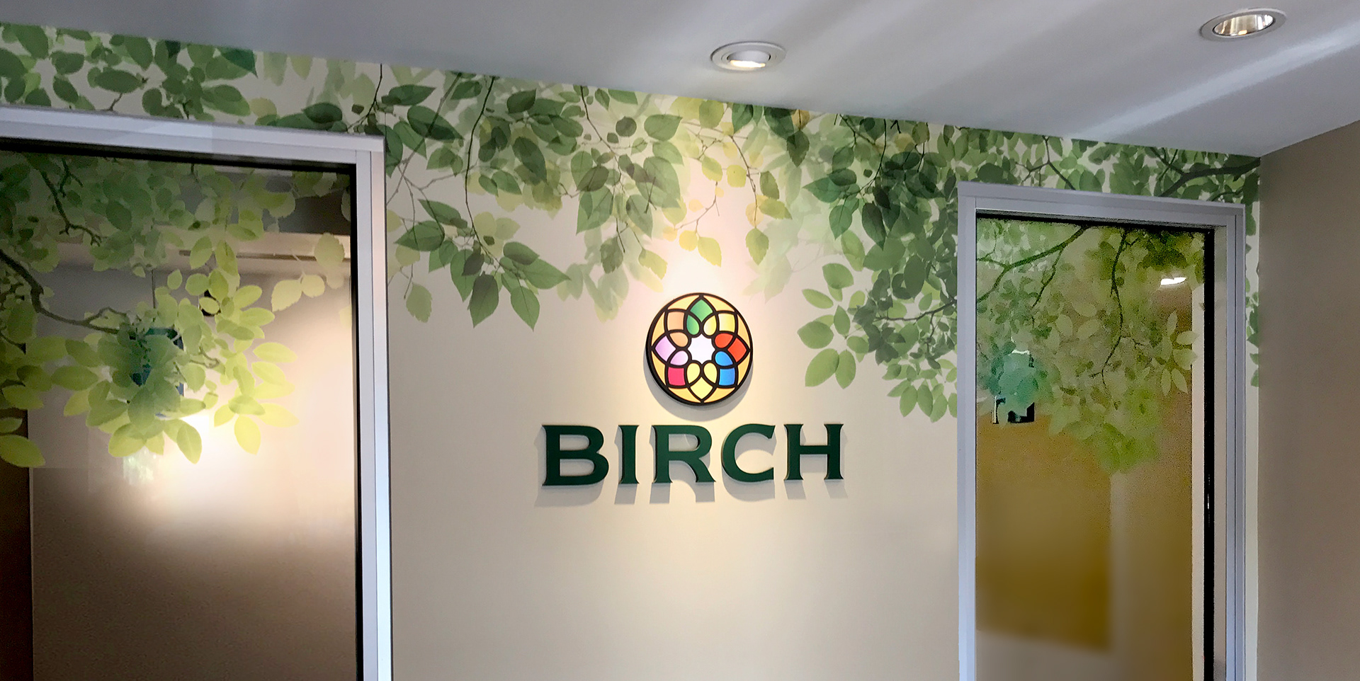
Lobby area at the Presbyterian Village at North Church
reflecting the building's names.

Accent wall in conference room showcasing PSC's tagline.
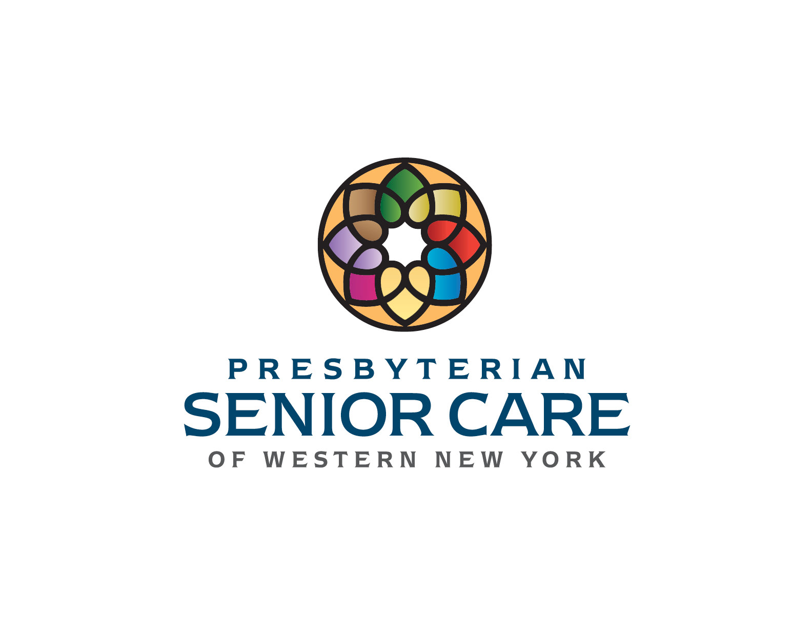
Presbyterian Senior Care (PSC) asked for a logo that was inviting to everyone while tying into their history and faith. The inspiration for the symbol was a rose window (found in many churches), combined with intertwined hearts symbolizing community. The stained glass colors were selected to further connect the nonprofit senior living campuses with their religious history.
The icon (once separated from its circle), transforms into a flower shape created with hearts. I then created a background pattern using the flower motif to be used as secondary graphics to enhance the brand’s distinctive style.
I refer to graphics other than the logo as secondary graphics. If someone removed your logo from your brochure or website, would people still be able to recognize your business? Backgrounds, colors, typefaces, etc. all contribute to a brand’s unique style.
Different colors were selected to separate and identify PSC’s three facilities along with their corporate and foundation divisions. These colors and graphics were incorporated into their marketing materials as well as environmental graphics at their facilities and corporate offices.
Marketing direction and copywriting by Of the Sea.