
Stark Tech Group provides smart building energy management solutions.
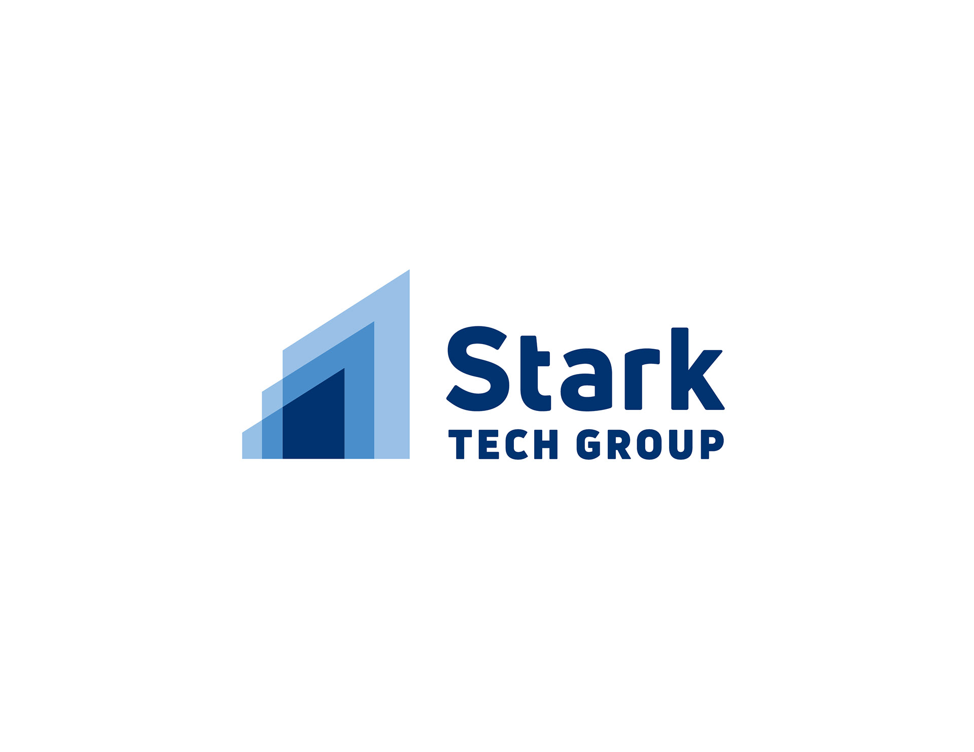
Stark is a growing company that wanted their new logo to communicate that growth as well as their established strength and technology capabilities.
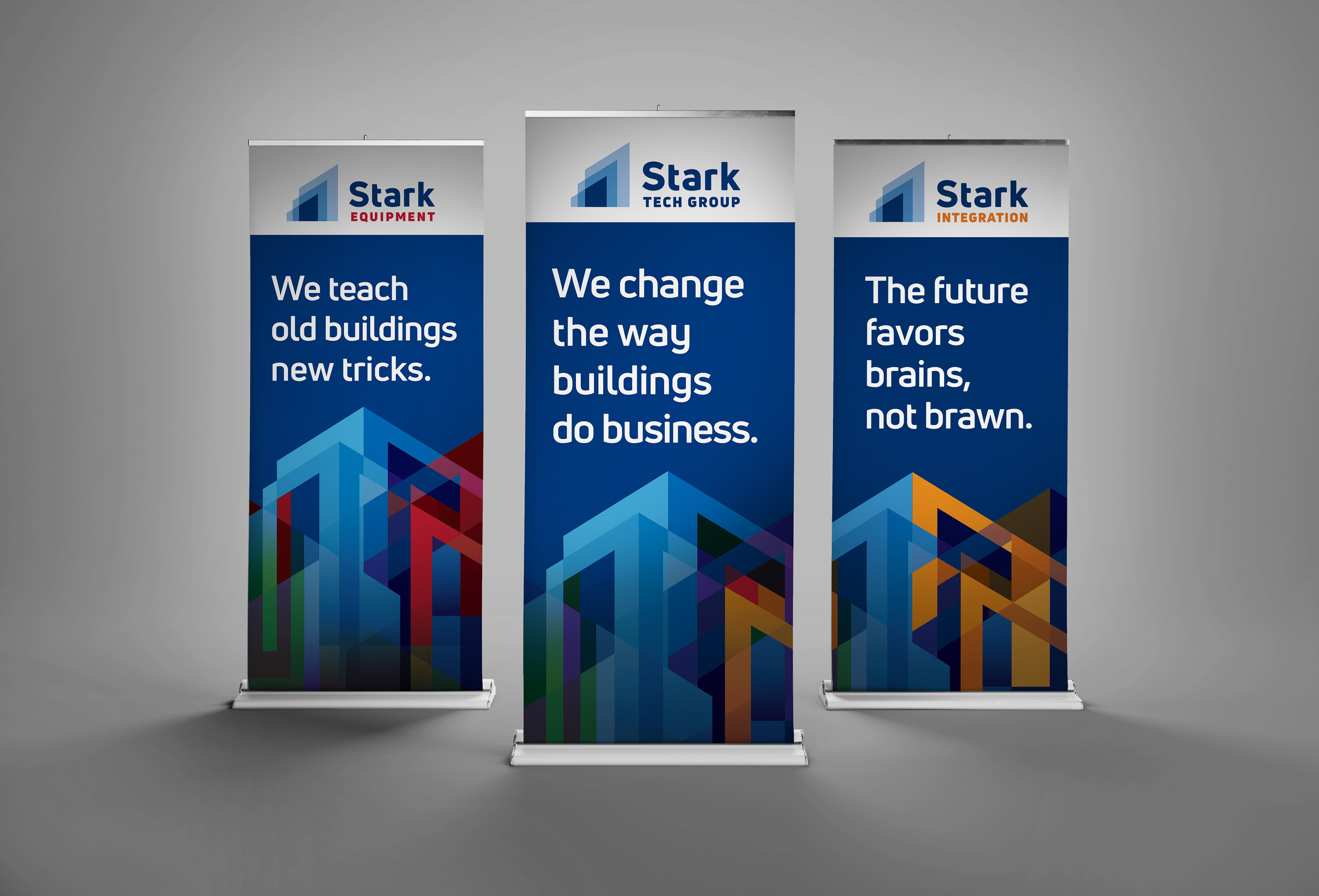
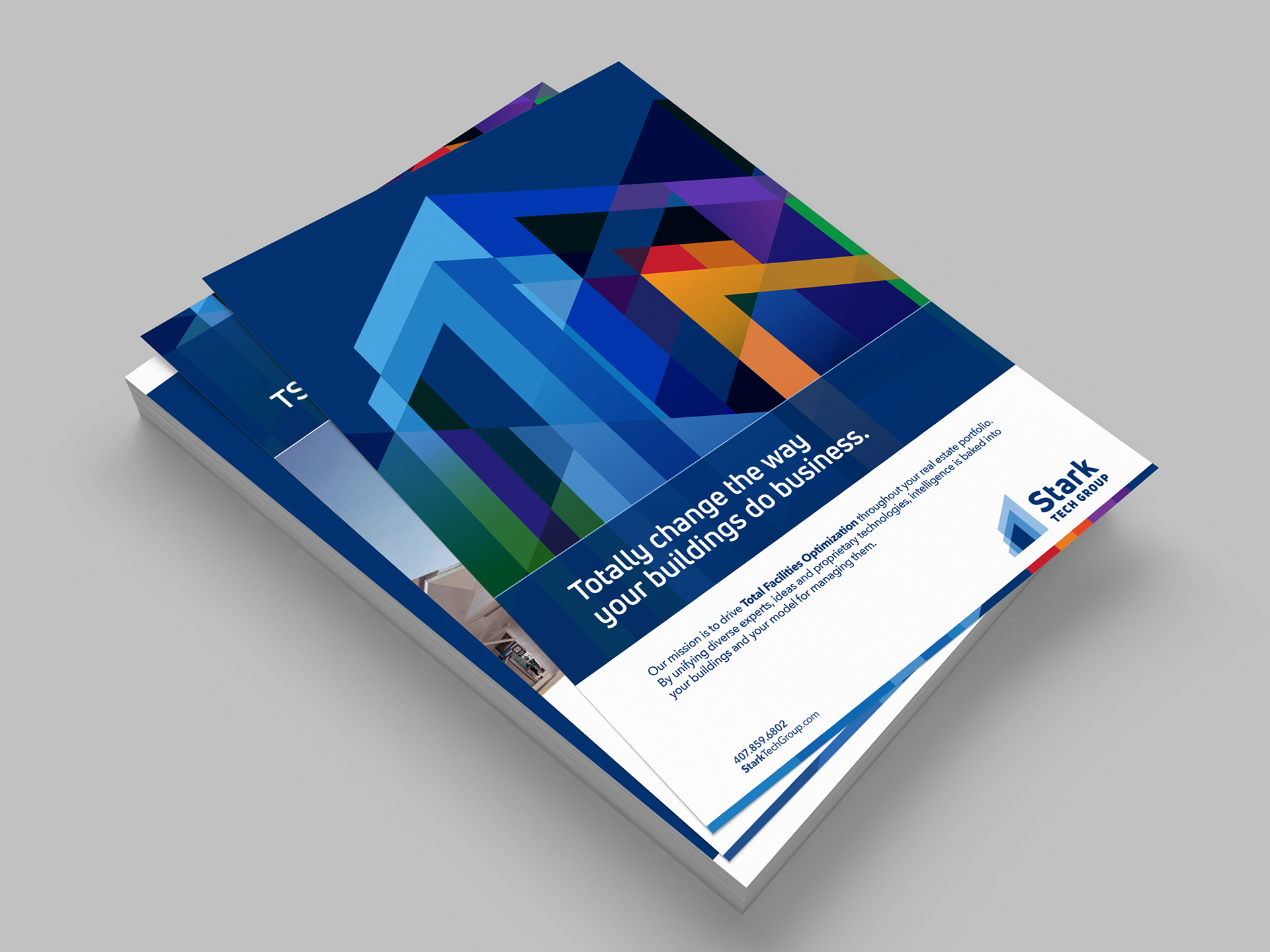
We first selected a typeface that had a strong tech feel. We then developed a symbol that incorporated abstract buildings to convey strength and stability, but at the same time motion – moving up and out. Blue was selected to reinforce professionalism, experience and stability.
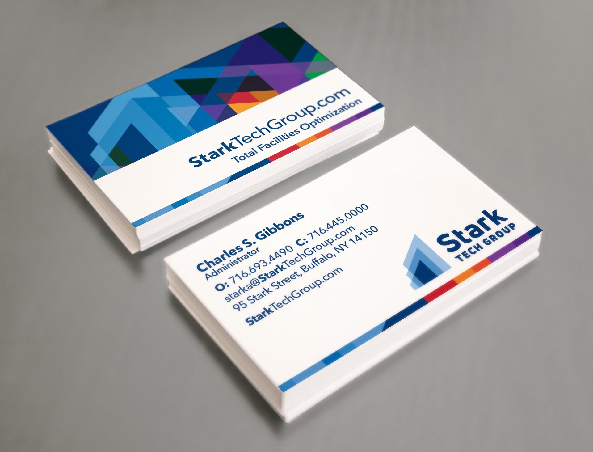
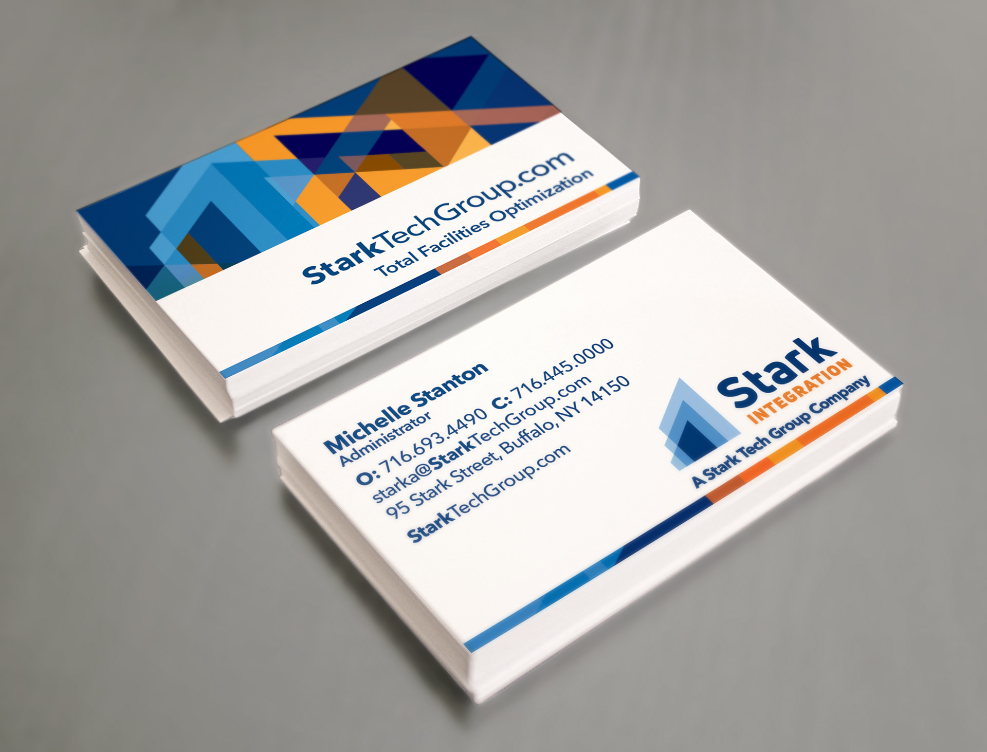
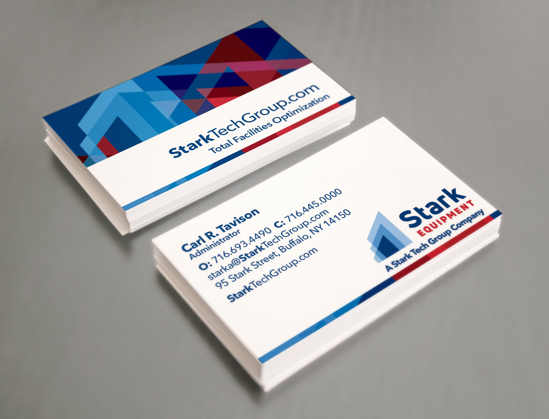
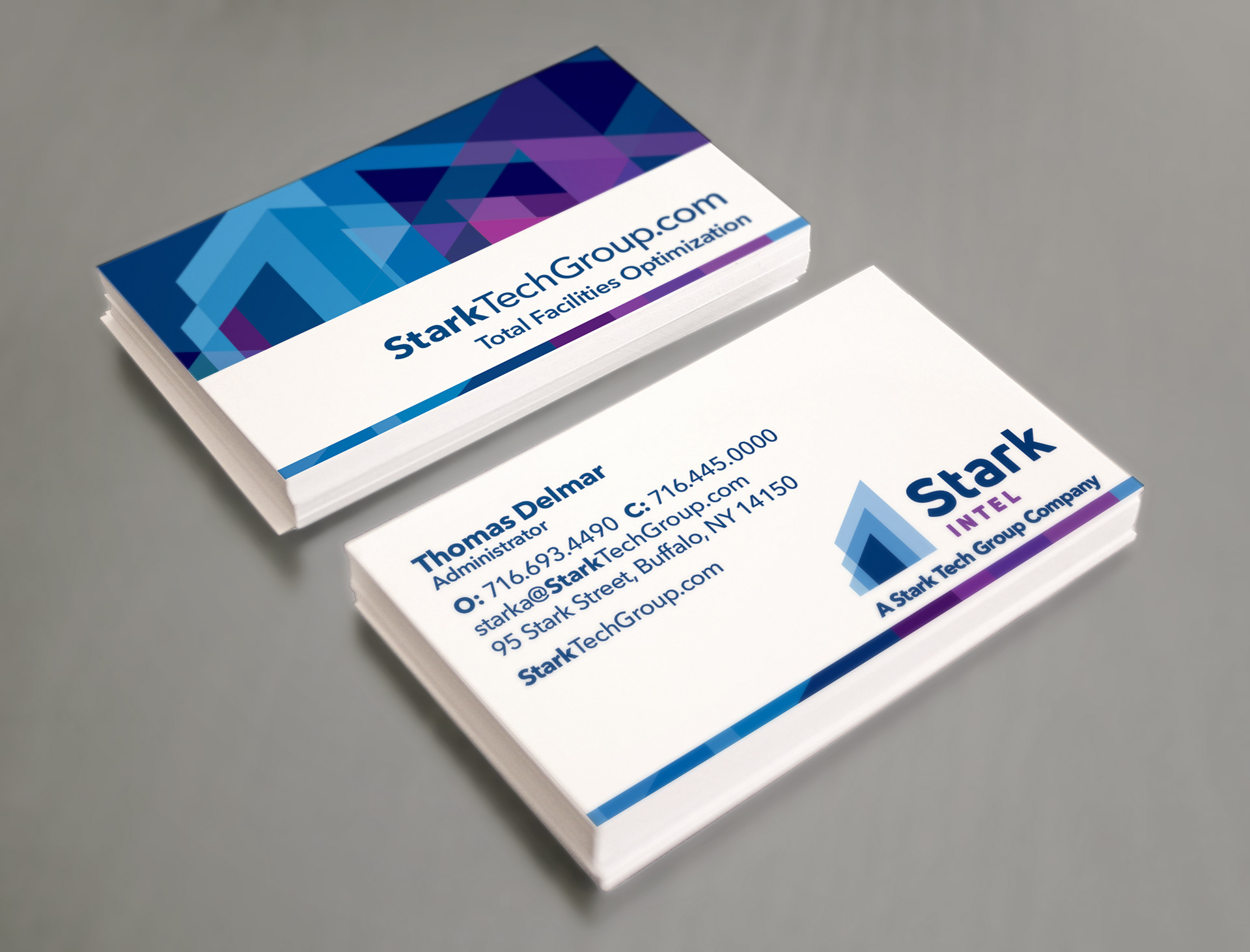
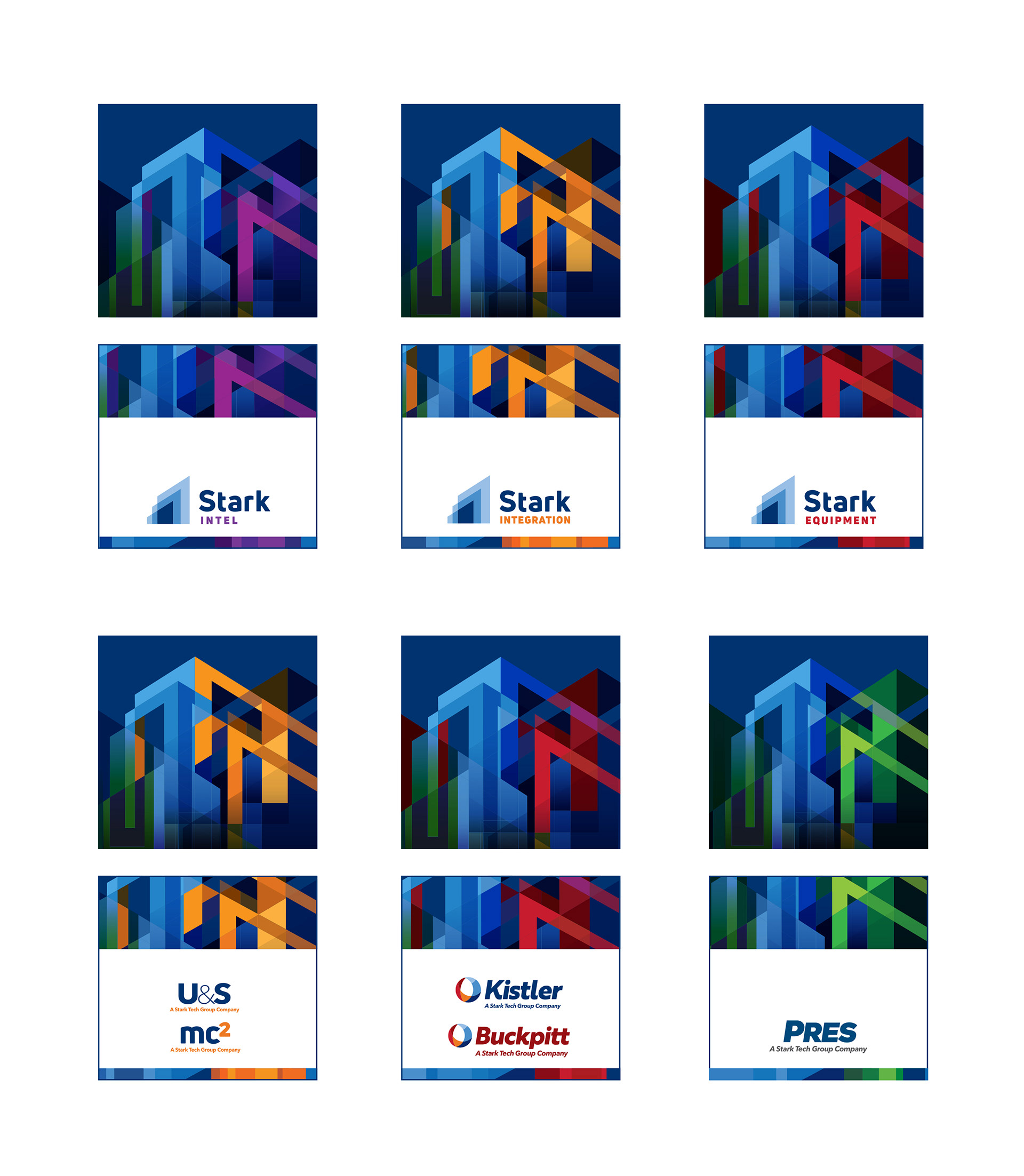
A color identity system also was created to differentiate newer company divisions.
Other promotional materials were quickly needed. I didn’t have access to photography of buildings, so I created an illustration that used Stark’s logo as a starting point. I added buildings to make it look more dimensional and more city-like. Colors were changed according to the color identity system to tie-in to Stark’s various divisions. These could be used as secondary graphics as whole or in part. Areas of the various illustrations were incorporated into banners, ads, flyers, and other marketing collateral.
Marketing direction and copywriting by Of the Sea.